Retü Foods
Retü is a plant-based food company founded by Dr. Ritu Chhatwal, who was frustrated with the lack of better-tasting, healthier, and more sustainable alternatives to dairy products on the market. During her quest, she came across millet as a nutritious, sustainably produced, and locally sourced protein source. This inspired her to create a range of products that could take advantage of this wonder food to provide natural, nutritious, and great tasting choices for everyone.
The Challenge
Retü faced the challenge of introducing a new, unfamiliar ingredient - millet - to the market and differentiating itself from other well-known dairy product brands like Nestlé, Chobani, and Danone. The company also needed to establish its brand personality, values, vision, and mission. Finally, it would need to identify its target audience and distribution channels.
Our Solution
We worked on developing a clear business blueprint, which served as a guide, to align the team on a value system and better articulate who they were to their clients and partners. They identified their brand personality as premium, innovative, high quality, collaborative, fun, creative, happy, and vibrant. They valued planet-positive, naturally balanced & nutrient-dense products, that made it easier for everyone to help the planet. The company's vision was to help the world eat its way out of extinction, and its mission was to continuously create delicious, nutritionally forward, farmer-friendly, planet-positive restorative foods using sustainable and local ingredients.
To differentiate itself from its competitors, Retü targeted relatively affluent millennials and Gen Zers. So, the brand focused on creating premium, high-quality, fun, vibrant, happy, collaborative, innovative, and creative products. They also identified their distribution channels, which included mom-and-pop shops, traditional retail stores, supermarkets, and potentially gyms.
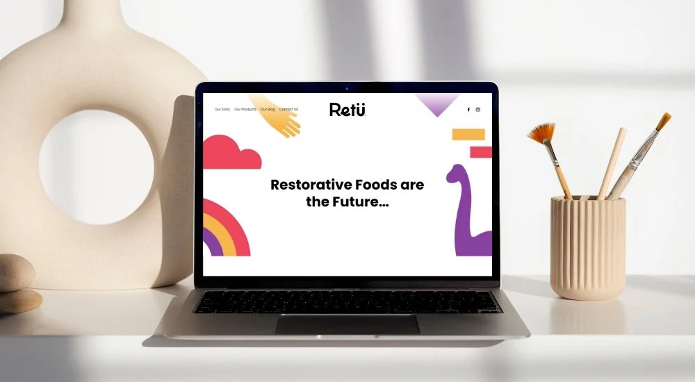
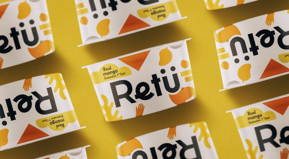
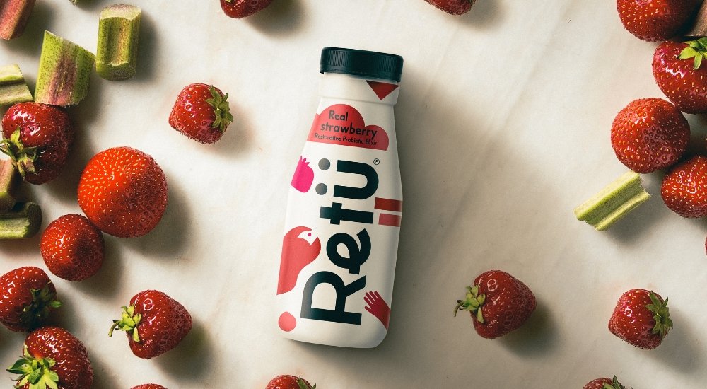
To establish their brand identity, we developed brand marks, including a core version of the brand marks (black) for use on white or light backgrounds, and a white version of the brand marks for use on dark backgrounds. They created guidelines to maintain consistency and clarity and recommended using their typefaces - Casablanca URW and Monserrat - in their branding materials.
We also created unique and recognizable illustrations that would represent their brand. They used simple silhouette forms, creating illustrations that were specific to each new flavor or fact. This approach helped them stand out in the market and attract attention from their target audience.
The Results
Our marketing efforts were successful in helping to establish Retü’s brand identity and differentiate it from its competitors. The company was able to attract its target audience and secure distribution channels, including traditional retail stores and supermarkets. Retü's unique and recognizable illustrations also helped the company stand out and establish a strong presence in the market.
We were able to overcome the challenges of introducing a new, unfamiliar ingredient to the market and differentiating the company from its competitors. This was achieved by developing a clear business blueprint, establishing its brand personality, values, vision, and mission, identifying its target audience and distribution channels, and creating unique and recognizable branding materials. These efforts ultimately helped Retü position itself and achieve success in the plant-based food industry.


